Selectively Highlighting Data Labels in Line Chart In Power BI
Using conditional color formatting to selectively highlight data labels in line charts


Conditionally Highlighting Data Labels
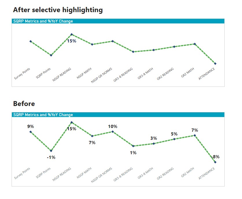
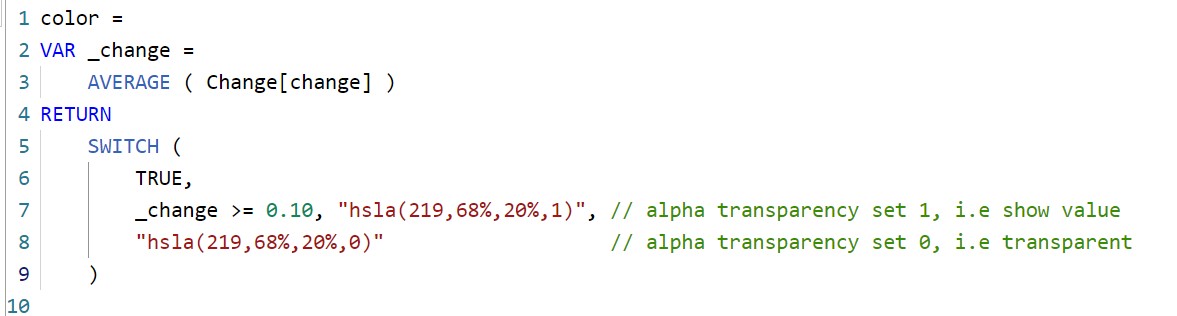
Conditional formatting is not new in Power BI however in August 2022 release a new option was added for conditionally highlighting data labels in charts. It works the exact same way by clicking on the "fx" button in formatting options. This opens new way of selectively highlighting data labels by changing colors and color transperancy. I have written about changing color transperancy using HSLA in my previous blog so I will directly show the the DAX and the before/after.
In the chart below, I have added conditional formatting to only show values that are above 10%. You can use any complex logic that can be written in DAX.
Other Ways
There are several other ways to achive the same end result. You can read them here or watch below video: