Dynamically Changing the Color Transparency in Power BI
A very easy and effective way to dynamically and conditionally change the color transperancy in Power BI


Changing the Color Transperancy
As someone who uses Python/R heavily for exploratory data analysis and Power BI for publishing the final data analytics reports, I have always missed the ability to adjust the color transperancy in Power BI. In Power BI you can change the color dynamically and conditionally but there is no native functionality to change the transperancy.
I was working on a project where I wanted to highlight certain clusters in the data to the business user. Sure, I could change the color but it's very challenging when the data points are concentrated in a small area and they overlap each other. In Python and R you can easily adjust the alpha value in most plots to see the dense area clearly.
Solution
The solution is to create a measure that passes a color as HSLA values. HSLA is Hue, Saturation, Lightness & Alpha. It's the alpha value that can be adjusted to make any color transparent. In Power BI you can pass color values as HEX, RGB, CSS color names and as HSLA. All you have to do find the HSLA color by using an online color converter such as this one :https://htmlcolors.com/hsla-color and voila you can now adjust the transparency dynamically by coupling it with What-If parameter. Below are the steps.
- Find the HSLA color using the online conveter
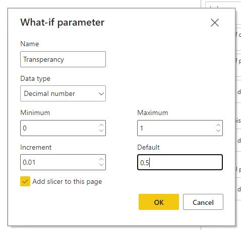
- Create a What If parameter. This is optional. If you want to hard code the alpha value, you can just include that in the measure. When developing the viz, you may first want to use the what-if to find which alpha value works the best for your case and then just hard code it in the measure.
-
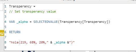
Create measures with HSLA value
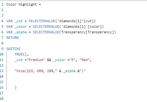
Additional measure if you want to highlight a category
-
Now in conditional formatting option (the 'fx' button), pick '
Field Valueand select the measure.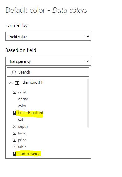
Consider the first scatterplot below. In this case the data points are so dense that it's hard to figure out exactly where the points are concentrated.
import pandas as pd
import seaborn as sns
import matplotlib.pyplot as plt
import altair as alt
df = pd.read_csv("https://raw.githubusercontent.com/selva86/datasets/master/diamonds.csv").sample(5000)
df.head()
The original dataset has 53000 rows. For demonstration I will sample 5000 rows randomly.
df.shape
alt.Chart(df).mark_circle(size=60).encode(
    x='carat',
    y='price',

).interactive()
As you can see in the plot above, the data points overlap each other and it's hard to see the distribution of the data. In most python and R libraries you can specify the alpha or opacity values to better understand the data density.
alt.Chart(df).mark_circle(size=60).encode(
    x='carat',
    y='price',

).configure_mark(
    opacity=0.01,

).interactive()
Now it's much easier to see that the most data points are concetrated in the lower left region. With the method shown above, you can implement the same technique in Power BI.
from IPython.display import IFrame

pbi = 'https://app.powerbi.com/view?r=eyJrIjoiOTY2YTBhODctNmFhNS00OTFhLThiZmYtZmY4OTI3OTZiMzQ0IiwidCI6IjkxMzc2MWU4LTc4NjEtNDc0ZS05ZjM4LWQyZDc1MjUwMDExZiJ9'

IFrame(pbi, width=800, height=600)
- The same technique can be used to highlight certain observations based on a logical condition set in a measure. Because we can set the transparency, we can make those observation pop in the plot and send other observations to the background.
- This can also be used to make certain data points invisible. For example, if you wanted to hide certain data just set the
alphavalue to 0 in the measure and now those data points (or even text) can be made invisible !