Adding Interactive Widgets To Visuals Using Deneb in Power BI
Deneb custom visual can be used to create interactive, composite visuals that are highly responsive and are customizable


Deneb is a free Microsoft certified custom visual available in the Apps gallery. Unlike many other custom visuals, it's highly customizable and fairly easy to setup. It uses JSON syntax of the Vega/Vega-Lite languages to create visuals. You can read more about it on it's official site. Kudos to its creator Daniel Marsh-Patrick for open-sourcing it. Please support his efforts here. Also check out some awesome visuals created by Kerry Kolosko using Deneb.
As I have mentioned before on my blog, I use Python & Power BI together in my workflow. Since Deneb uses Vega-Lite, I can use any other Vega-Lite library to develop the visuals and use them in Power BI with Deneb. While you can build Deneb visuals using JSON, I like using Altair to create the visuals and then use that JSON in Deneb. I have already created a video on how you can do that. Please watch it to learn more, I won't cover it here again.
The goal of this blog is to show you three things that are not possible in native Power BI visuals:
- Adding interactive widgets that are bound to a visual
- Creating data-driven conditional labels
- Creating composite visuals by layering and adding visuals to each other to build more complex visuals
Be sure read my other blog on changing color transperancy using native Power BI visuals. You can achieve similar effect in Power BI but it's not as responsive and has limitations.
You can think of widgets as the slicers that are bound to a visual and can be used by the user to control various formatting options of the visual. This can be used to personalize the visual, as well help in exploring the data interactively. These widgets can be slicers, radio buttons, dropdowns etc. Unlike the Power BI slicer, since these are bound to the visual, they are very responsive. I will show couple of example of how you can use Altair to first build the visual and then use the JSON to re-create it in Power BI.
To build the visual, we don't really need data from Power BI. We can use some dummy data to build the visual, which can then be transferred to Deneb. I will use Pandas for creating the dataframe.
import pandas as pd
import altair as alt
import numpy as np

print("Altair version:",alt.__version__)
Creating a dummy dataframe with X, Y, Z columns with 50 observations.
df = pd.DataFrame({
    'X': range(50),
    'Y': np.random.rand(50).cumsum(),
    'Z': np.random.rand(50)*100
}
).round(0)

df.head()
Building Base Visuals
I will build two visuals and show how you can create a composite visual. Try interacting with the visual by zooming and hovering. I have annotated the code below if you are not familiar with Altair. If you have never used Altair before, still follow along. The code we generate from the visual can be applied to any data in Power BI.
In this example, we want to build an interactive, composite visual to analyze multivariate data. The bar chart shows X vs. Z and the scatter plot shows X vs Y. We are interested in analyzing the Z variable. By adding interactivity, we can visualize Z in XZ and YZ planes in a single visual.
First I will create the base visuals with conditional formatting and then show how to add the widget.
bar = (alt.Chart(df).mark_bar().encode(                                            #Create a bar chart using df dataframe
    x='X',                                                                         #X variable
    y='Z',                                                                         #Y variable is Z
    tooltip=['X','Y','Z'],                                                         #Add tooltip
    color=alt.condition(
        alt.datum.Z< 20,                                                          #Conditional formatting, threshold 20
        alt.value('#477998'), alt.value('hsla(232, 7%, 20%, 0.25)'),              #if Z < 20, Blue otherwise gray

    )
).properties(width=500, height=400, title="Bar Chart with Widget"))

text = bar.mark_text(
    align='right',                                                                #add text label
    baseline='middle',                                                            #align data labels

    dx= 3, dy= -5                                                                 #align x & y positions of labels
).encode(
    text='Z:Q',
    color=alt.condition(
        alt.datum.Z< 20,                                                          #Conditional formatting, threshold 20
        alt.value('#477998'), alt.value('hsla(232, 7%, 20%, 0)'))                 #only show label if Z < 20, 0 is for alpha
)

bartext = (bar + text).interactive()                                             #add bar chart layer to text layer
bartext
scatter = (alt.Chart(df).mark_circle().encode(                             #Create a scatterplot using df dataframe
    x='X',                                                                 #X axis is X
    y='Y',                                                                 #Y axis uses Y variable
    tooltip=['X','Y','Z'],
    color=alt.condition(
        alt.datum.Z < 20,
        alt.value('red'), alt.value('hsla(232, 7%, 20%, 0.25)')
    )
).properties(width=300, height=400, title="Sactterplot with Widget"))

scatter.interactive()
Let's combine these two to make a composite chart. This is a single visual now with two chart types.
(bartext | scatter)
Few things to notice in the code above:
- For the bar chart, I have defined an alternate condition that values less than 20 are blue in color and values above 20 are gray
- I added text as another chart on top of the bar chart. This allow us to create data-driven labels. In the options, notice I defined the text color as
hsla(232, 7%, 20%, 0). The last value here0is thealphathat defines the transperancy. If Z > 20, the text will be become transparent and only values below 20 will be appear. - For scatterplot, values below 20 are red and values above 20 are gray
- I combined the two charts together using " | ".
In the base visuals, I defined the color threshold 20 manually. Now we want to add a slicer widget so the user can control that threshold. To do that, we have to define a selector and bind that to the visuals above.
Below I am defining the min and max range for the slicer, name of the slicer and the default value.
slider = alt.binding_range(min=0, max=100, step=1, name='color_threshold:')
selector = alt.selection_single(name="SelectorName", fields=['color_threshold'],
                                bind=slider, init={'color_threshold': 20})
rule = alt.Chart(df).mark_rule(color='red').encode(
    x = selector.color_threshold
)
Now I just need to change the color threshold value I entered (20) to the slider variable color_threshold and bind the selector to the visuals.
bar = (alt.Chart(df).mark_bar().encode(                                        #Create a bar chart using df dataframe
    x='X',                                                                     #X variable
    y='Z',                                                                     #Y variable is Z
    tooltip=['X','Y','Z'],                                                     #Add tooltip
    color=alt.condition(
        alt.datum.Z< selector.color_threshold,                                 #Conditional formatting the selector variable
        alt.value('#477998'), alt.value('hsla(232, 7%, 20%, 0.25)'),           #if Z < 20, Blue otherwise gray

    )
).properties(width=500, height=400, title="Bar Chart with Widget"))

text = bar.mark_text(
    align='right',                                                                #add text label
    baseline='middle',                                                            #align data labels

    dx= 3, dy= -5                                                                 #align x & y positions of labels
).encode(
    text='Z:Q',
    color=alt.condition(
        alt.datum.Z< selector.color_threshold,                                   #Conditional formatting
        alt.value('#477998'), alt.value('hsla(232, 7%, 20%, 0)'))
)

bartext = (bar + text).interactive()
bartext


scatter = (alt.Chart(df).mark_circle().encode(                             #
    x='X',
    y='Y',
    tooltip=['X','Y','Z'],
    color=alt.condition(
        alt.datum.Z < selector.color_threshold,                                   #passed the color_threshold variable
        alt.value('red'), alt.value('hsla(232, 7%, 20%, 0.25)')
    )
).properties(width=300, height=400, title="Sactterplot with Widget"))

scatter.interactive()


final =(bartext | scatter).add_selection(
    selector
)

final
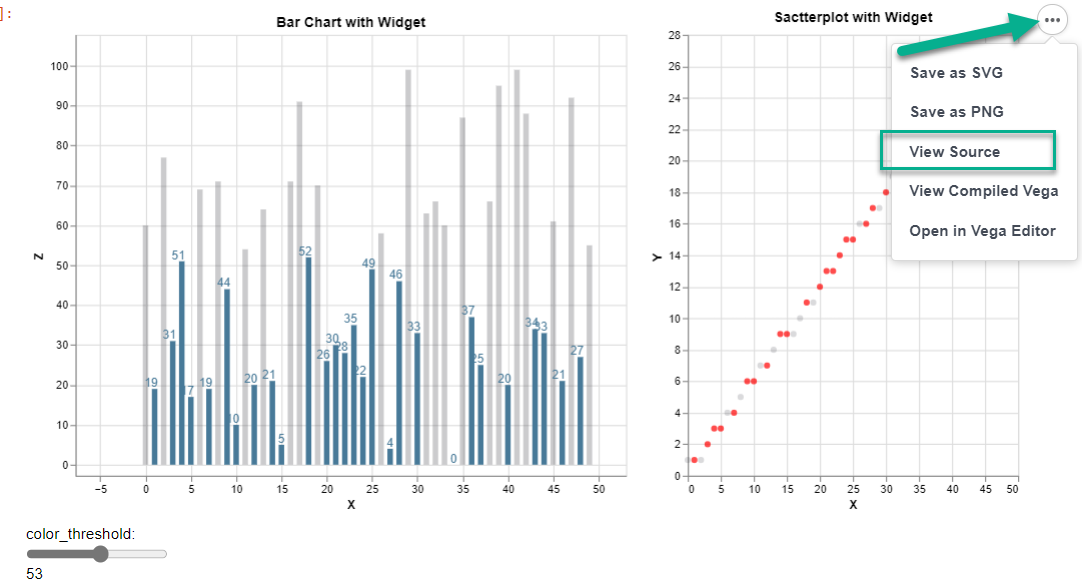
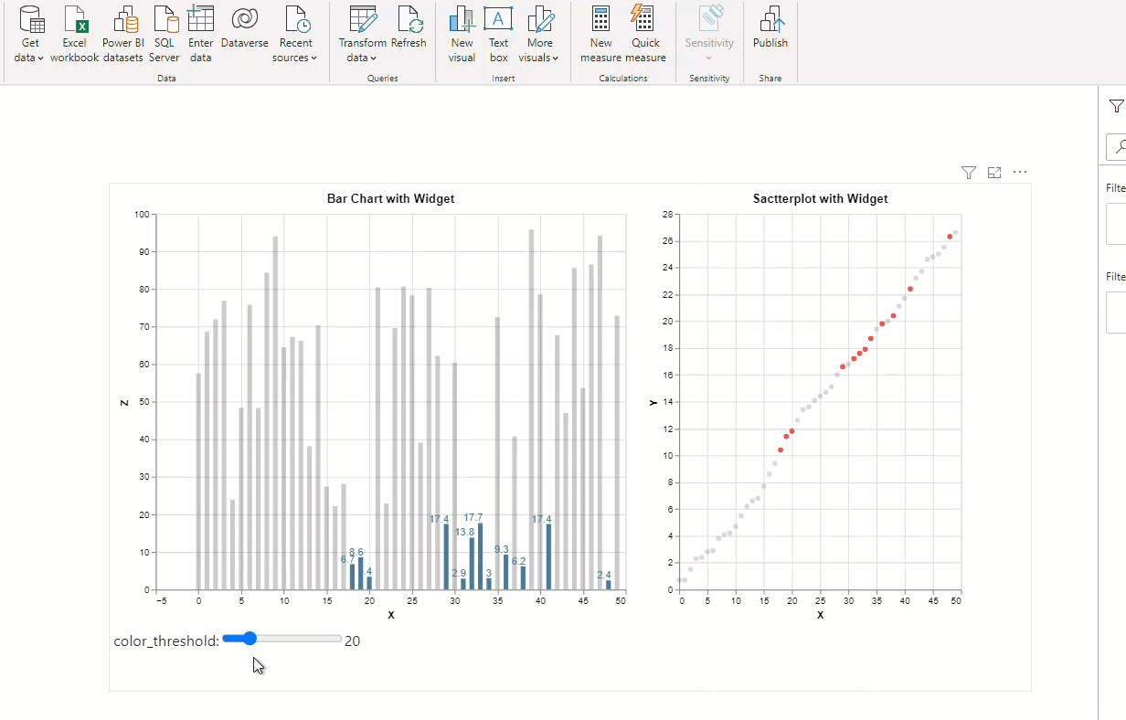
Try changing the color_threshold value to see how the charts behave. As you change the slider, bars below the threshold are highlighted in blue, their labels appear and the corrseponding values in X & Y are highlighted in red in the scatter plot. Notice how responsive the charts are.
To extract the JSON from the visual, you can use to_json() method or you can just click on the three dots in the top right hand corner of the above visual and select View Source as show below. This will give you the JSON that can be used in Deneb.
#hide_output
{
  "config": {"view": {"continuousWidth": 400, "continuousHeight": 300}},
  "hconcat": [
    {
      "layer": [
        {
          "mark": "bar",
          "encoding": {
            "color": {
              "condition": {
                "value": "#477998",
                "test": "(datum.Z < SelectorName.color_threshold)"
              },
              "value": "hsla(232, 7%, 20%, 0.25)"
            },
            "tooltip": [
              {"type": "quantitative", "field": "X"},
              {"type": "quantitative", "field": "Y"},
              {"type": "quantitative", "field": "Z"}
            ],
            "x": {"type": "quantitative", "field": "X"},
            "y": {"type": "quantitative", "field": "Z"}
          },
          "height": 400,
          "selection": {
            "selector017": {
              "type": "interval",
              "bind": "scales",
              "encodings": ["x", "y"]
            },
            "SelectorName": {
              "type": "single",
              "fields": ["color_threshold"],
              "bind": {
                "input": "range",
                "max": 100,
                "min": 0,
                "name": "color_threshold:",
                "step": 1
              },
              "init": {"color_threshold": 20}
            }
          },
          "title": "Bar Chart with Widget",
          "width": 500
        },
        {
          "mark": {
            "type": "text",
            "align": "right",
            "baseline": "middle",
            "dx": 3,
            "dy": -5
          },
          "encoding": {
            "color": {
              "condition": {
                "value": "#477998",
                "test": "(datum.Z < SelectorName.color_threshold)"
              },
              "value": "hsla(232, 7%, 20%, 0)"
            },
            "text": {"type": "quantitative", "field": "Z"},
            "tooltip": [
              {"type": "quantitative", "field": "X"},
              {"type": "quantitative", "field": "Y"},
              {"type": "quantitative", "field": "Z"}
            ],
            "x": {"type": "quantitative", "field": "X"},
            "y": {"type": "quantitative", "field": "Z"}
          },
          "height": 400,
          "title": "Bar Chart with Widget",
          "width": 500
        }
      ]
    },
    {
      "mark": "circle",
      "encoding": {
        "color": {
          "condition": {
            "value": "red",
            "test": "(datum.Z < SelectorName.color_threshold)"
          },
          "value": "hsla(232, 7%, 20%, 0.25)"
        },
        "tooltip": [
          {"type": "quantitative", "field": "X"},
          {"type": "quantitative", "field": "Y"},
          {"type": "quantitative", "field": "Z"}
        ],
        "x": {"type": "quantitative", "field": "X"},
        "y": {"type": "quantitative", "field": "Y"}
      },
      "height": 400,
      "selection": {
        "SelectorName": {
          "type": "single",
          "fields": ["color_threshold"],
          "bind": {
            "input": "range",
            "max": 100,
            "min": 0,
            "name": "color_threshold:",
            "step": 1
          },
          "init": {"color_threshold": 20}
        }
      },
      "title": "Sactterplot with Widget",
      "width": 300
    }
  ],
  "data": {"name": "data-2a92a2aad2788a9669f8b00966e4e773"},
  "$schema": "https://vega.github.io/schema/vega-lite/v4.8.1.json",
  "datasets": {
    "data-2a92a2aad2788a9669f8b00966e4e773": [
      {"X": 0, "Y": 1, "Z": 60},
      {"X": 1, "Y": 1, "Z": 19},
      {"X": 2, "Y": 1, "Z": 77},
      {"X": 3, "Y": 2, "Z": 31},
      {"X": 4, "Y": 3, "Z": 51},
      {"X": 5, "Y": 3, "Z": 17},
      {"X": 6, "Y": 4, "Z": 69},
      {"X": 7, "Y": 4, "Z": 19},
      {"X": 8, "Y": 5, "Z": 71},
      {"X": 9, "Y": 6, "Z": 44},
      {"X": 10, "Y": 6, "Z": 10},
      {"X": 11, "Y": 7, "Z": 54},
      {"X": 12, "Y": 7, "Z": 20},
      {"X": 13, "Y": 8, "Z": 64},
      {"X": 14, "Y": 9, "Z": 21},
      {"X": 15, "Y": 9, "Z": 5},
      {"X": 16, "Y": 9, "Z": 71},
      {"X": 17, "Y": 10, "Z": 91},
      {"X": 18, "Y": 11, "Z": 52},
      {"X": 19, "Y": 11, "Z": 70},
      {"X": 20, "Y": 12, "Z": 26},
      {"X": 21, "Y": 13, "Z": 30},
      {"X": 22, "Y": 13, "Z": 28},
      {"X": 23, "Y": 14, "Z": 35},
      {"X": 24, "Y": 15, "Z": 22},
      {"X": 25, "Y": 15, "Z": 49},
      {"X": 26, "Y": 16, "Z": 58},
      {"X": 27, "Y": 16, "Z": 4},
      {"X": 28, "Y": 17, "Z": 46},
      {"X": 29, "Y": 17, "Z": 99},
      {"X": 30, "Y": 18, "Z": 33},
      {"X": 31, "Y": 19, "Z": 63},
      {"X": 32, "Y": 19, "Z": 66},
      {"X": 33, "Y": 19, "Z": 60},
      {"X": 34, "Y": 20, "Z": 0},
      {"X": 35, "Y": 20, "Z": 87},
      {"X": 36, "Y": 21, "Z": 37},
      {"X": 37, "Y": 22, "Z": 25},
      {"X": 38, "Y": 22, "Z": 66},
      {"X": 39, "Y": 22, "Z": 95},
      {"X": 40, "Y": 23, "Z": 20},
      {"X": 41, "Y": 23, "Z": 99},
      {"X": 42, "Y": 24, "Z": 88},
      {"X": 43, "Y": 24, "Z": 34},
      {"X": 44, "Y": 25, "Z": 33},
      {"X": 45, "Y": 25, "Z": 61},
      {"X": 46, "Y": 26, "Z": 21},
      {"X": 47, "Y": 26, "Z": 92},
      {"X": 48, "Y": 27, "Z": 27},
      {"X": 49, "Y": 27, "Z": 55}
    ]
  }
}
To use it in Deneb, you will need to make three changes to the code above:
- Change the names X, Y and Z to the names of the columns you will be using in Power BI. For example, if you want to use
Salescolumn on Y axis, wherever you see Y in the code above, change it to Sales - Change
'data': {'name': 'data-22c7bda41ed58dcd275c5ceb7d2df6d9'}to'data': {'name': 'dataset'} - Delete everything starting from
'$schema'and below
The final JSON you need is below. You can customize the width, height, title, column names, column type, colors, threshold based on your needs.
’type’: ’quantitative’ below to ’type’: ’nominal’
#hide_output
{
  "config": {
    "view": {
      "continuousWidth": 400,
      "continuousHeight": 300
    }
  },
  "hconcat": [
    {
      "layer": [
        {
          "mark": "bar",
          "encoding": {
            "color": {
              "condition": {
                "value": "#477998",
                "test": "(datum.Z < SelectorName.color_threshold)"
              },
              "value": "hsla(232, 7%, 20%, 0.25)"
            },
            "tooltip": [
              {
                "type": "quantitative",
                "field": "X"
              },
              {
                "type": "quantitative",
                "field": "Y"
              },
              {
                "type": "quantitative",
                "field": "Z"
              }
            ],
            "x": {
              "type": "quantitative",
              "field": "X"
            },
            "y": {
              "type": "quantitative",
              "field": "Z"
            }
          },
          "height": 400,
          "selection": {
            "selector017": {
              "type": "interval",
              "bind": "scales",
              "encodings": ["x", "y"]
            },
            "SelectorName": {
              "type": "single",
              "fields": [
                "color_threshold"
              ],
              "bind": {
                "input": "range",
                "max": 100,
                "min": 0,
                "name": "color_threshold:",
                "step": 1
              },
              "init": {
                "color_threshold": 20
              }
            }
          },
          "title": "Bar Chart with Widget",
          "width": 500
        },
        {
          "mark": {
            "type": "text",
            "align": "right",
            "baseline": "middle",
            "dx": 3,
            "dy": -5
          },
          "encoding": {
            "color": {
              "condition": {
                "value": "#477998",
                "test": "(datum.Z < SelectorName.color_threshold)"
              },
              "value": "hsla(232, 7%, 20%, 0)"
            },
            "text": {
              "type": "quantitative",
              "field": "Z"
            },
            "tooltip": [
              {
                "type": "quantitative",
                "field": "X"
              },
              {
                "type": "quantitative",
                "field": "Y"
              },
              {
                "type": "quantitative",
                "field": "Z"
              }
            ],
            "x": {
              "type": "quantitative",
              "field": "X"
            },
            "y": {
              "type": "quantitative",
              "field": "Z"
            }
          },
          "height": 400,
          "title": "Bar Chart with Widget",
          "width": 500
        }
      ]
    },
    {
      "mark": "circle",
      "encoding": {
        "color": {
          "condition": {
            "value": "red",
            "test": "(datum.Z < SelectorName.color_threshold)"
          },
          "value": "hsla(232, 7%, 20%, 0.25)"
        },
        "tooltip": [
          {
            "type": "quantitative",
            "field": "X"
          },
          {
            "type": "quantitative",
            "field": "Y"
          },
          {
            "type": "quantitative",
            "field": "Z"
          }
        ],
        "x": {
          "type": "quantitative",
          "field": "X"
        },
        "y": {
          "type": "quantitative",
          "field": "Y"
        }
      },
      "height": 400,
      "selection": {
        "SelectorName": {
          "type": "single",
          "fields": ["color_threshold"],
          "bind": {
            "input": "range",
            "max": 100,
            "min": 0,
            "name": "color_threshold:",
            "step": 1
          },
          "init": {
            "color_threshold": 20
          }
        }
      },
      "title": "Sactterplot with Widget",
      "width": 300
    }
  ],
  "data": {
    "name": "dataset"
  }
}
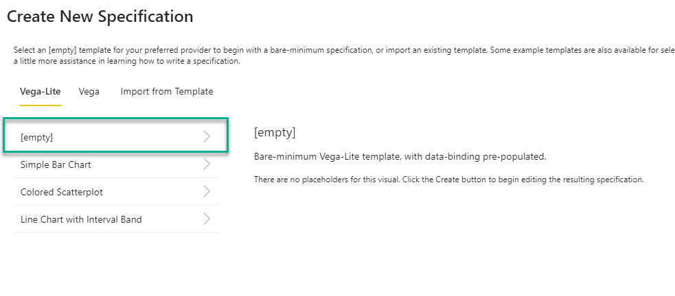
- Install Deneb from App Source. Add your columns to the visual.
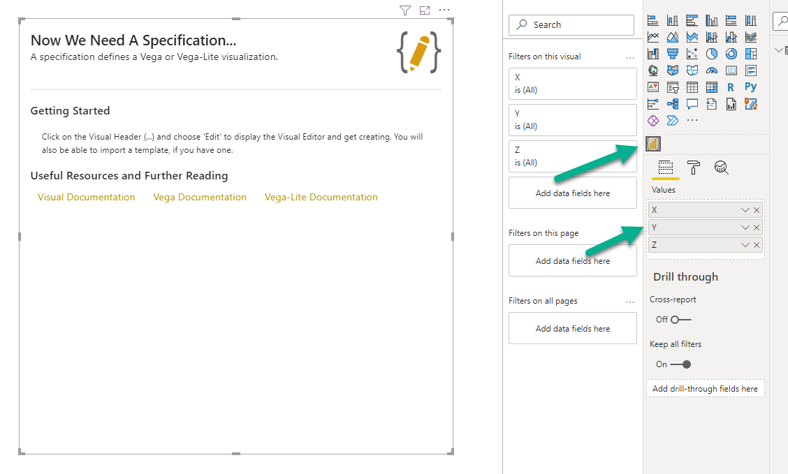
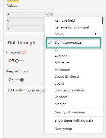
- Make sure you remove the summarization
- Select Edit from the three dots in the top right hand corner
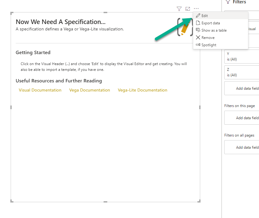
- Select Empty as we will be adding the code we extracted above
- Add the JSON code. You will see the message
Cannot read property type of nullin the right pane.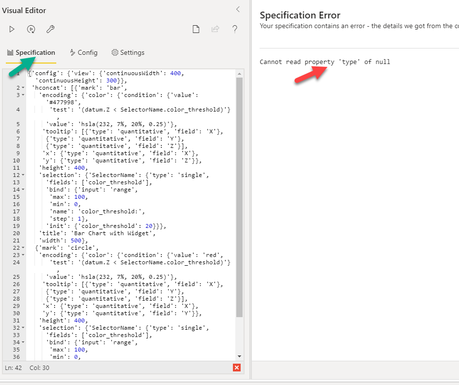
- To fix the message, click on the spanner.
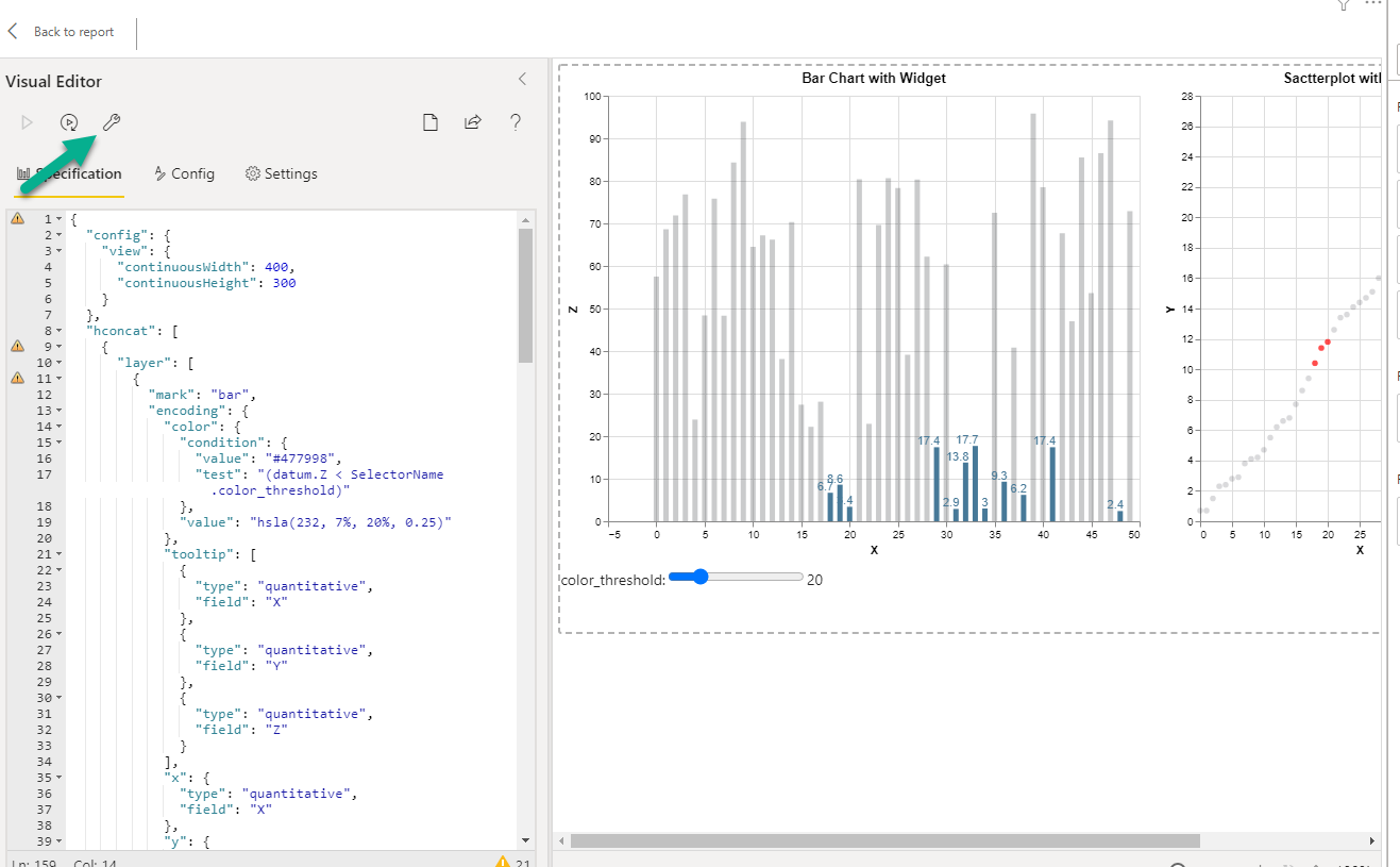
- This will render the visuals. Now just go back to the Power BI canvas and resize the window by dragging the corners. You can always change the width and height specified in the JSON to make it fit in your report as needed.
You can download the .pbix file from here
As I mentioned above, these widgets can be double slicers, radio buttons, dropdowns etc. and can be used to change pretty much any property of the visual. This is extremely powerful. Also as you saw above, you can create composite visuals that are very effective at analyzing complex, multivariate data. One thing I did not show in this blog is adding cross-highlighting. It's fairly easy to do that. You can read about it on Deneb's documentation. I will show it to in a future blog post.