Controlling Marker Size Sensitivity in Power BI Scatter Plot
Quick tip to adjust sensitivity of marker size in scatter plot


The Problem:
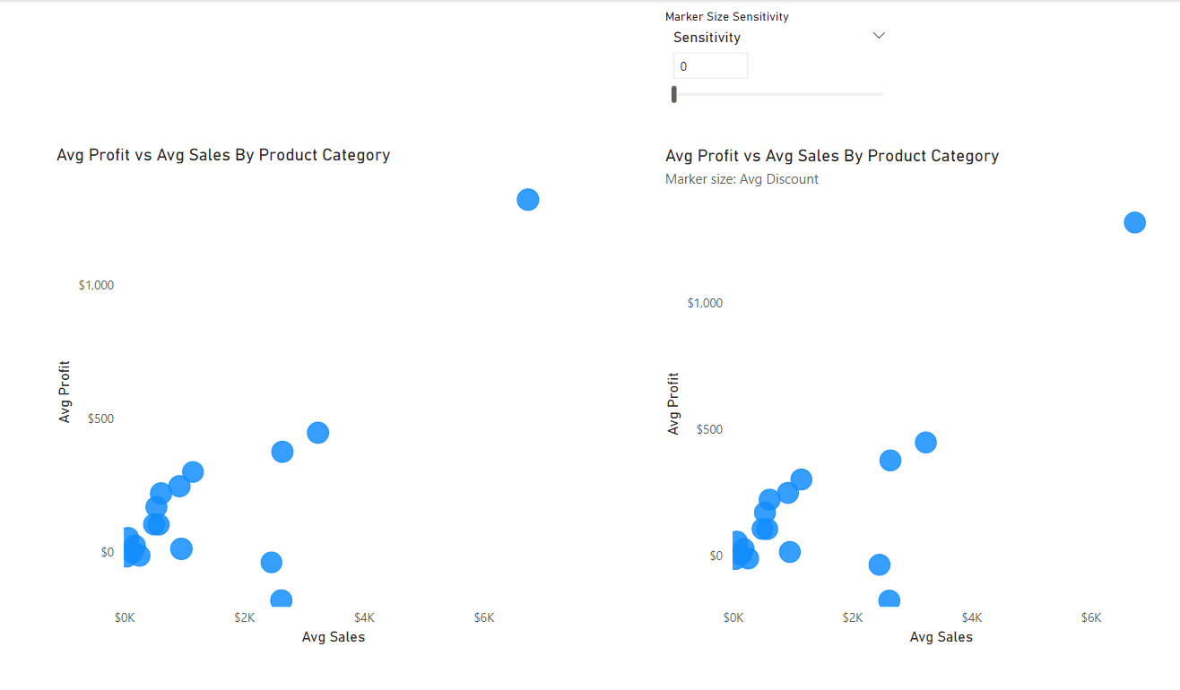
In Power BI, when you create a scatter plot, you have an option to change the size of the marker based on a column or a measure. This helps the user to do multivariate analysis by encoding the marker size. Although you can change the size of the marker, only the developer can set it and a big limitation is that the size scales uniformly. See below for example. The left scatter plot is the default and the one on the right is after controlling the sensitivity.
The Solution
Solution is rather simple. We just create another measure and exponentiate it to lengthen the scale. For example, if you have a measure [Sales] used to denote marker size, you use [Sales]^100. To give the developer and user better control, we can create parameter to adjust the value. Watch the video on how to do this :