Analysis of Broadband Internet Availability Across the US
Do communities across the US have same access to high-speed internet ?


I recently came across the Internet Equity Initiative by the Data Science Institute at University of Chicago. They have been studying how disparity in access to internet affects communities across Chicago. Since the pandemic started, we have been working and studying from home. It is critical to have access to not just internet but high-speed broadband internet so families can succeed in this new era of remote work/education. Technology can be a great equalizer but if any disparities exist, it can affect certain communities and put them at a disdvatnage. Microsoft's AI For Good team has been championing the issue of digital equity for a while. They relesed a study and dataset in 2019 that showed that 163M americans lack access to broadband internet, which was significanly higher than FCC's estimate of 25M.
I was curious to find out myself how much inequality, if any, exists not just around me but also across the US.In their analysis Microsoft looked at zip code level data. I was curious about two issues:
- Does your access to broadband internet depend on where you in the US ?
- Does median income of a community matter ?
Note here I am interested in access to the internet. A household may have means to purchase high speed internet but that does not mean they have high-speed internet in their area. So I am interested at the aggregate level, how much disparity exists.
Data
I will be using the data provided by Microsoft's AI For Good team under its Open Data initiative. This was a privatized data to protect privacy. You can read more about the data collection and methods used here. This dataset has zip code, county id and broadband usage percentage. Margin of error is also available but I will disregard that for initial analysis. The usage number shows how many households in that zip code had access to high speed internet (25MBPS+). I will combine this data with the US census data from 2020 to understand the distribution of usage across different areas in US.
import pandas as pd
import numpy as np
import matplotlib.pyplot as plt
import seaborn as sns
import altair as alt
import statsmodels.api as sm
import statsmodels.formula.api as smf
from IPython.display import IFrame
broadband_data_path = 'https://raw.githubusercontent.com/microsoft/USBroadbandUsagePercentages/master/dataset/broadband_data_zipcode.csv'


def clean_bbdf(path):
    '''
    Import data and clean column names

    '''
    df = pd.read_csv(broadband_data_path)

    df.columns = df.columns.str.replace(" ","_")

    return df.set_index('COUNTY_ID')

bbdf = clean_bbdf(broadband_data_path)

bbdf.head(3)
def data_quality(df):
    '''
    Check nulls and duplicates

    '''
    shape = df.shape
    is_na = df.isna().sum().any().sum()
    is_dupl = df['POSTAL_CODE'].duplicated().any().sum()

    return print(f'\n Shape: {shape} ,\n Has nulls: {is_na},\n Has duplicates: {is_dupl}')


data_quality(bbdf)
print(f'Number of states: {bbdf.ST.nunique()},  ')
print(f'Number of Counties: {bbdf.index.nunique()}')
Number of Households
The broadband data shows percentage of households with access to the broadband internet so the analysis has to be performed at the household level instead of population. I will use data from US Census to get the numbers.
#### Household Size


hh_path = 'https://raw.githubusercontent.com/pawarbi/datasets/master/households_2020.csv'


households = (pd.read_csv(hh_path, usecols = ['Geographic Area Name','Estimate!!Total!!HOUSEHOLDS!!Total households'])
              .assign(zipcode =  lambda s:s.iloc[:,0].str[5:])
              .dropna()
             )

households = (households[households['Geographic Area Name'] !="United States"]
              .drop('Geographic Area Name', axis=1)
              .astype('int')
              .set_index('zipcode')
              .rename(columns={'Estimate!!Total!!HOUSEHOLDS!!Total households':'households'})

             )


households.head(3)
Next I will aggregate the data to get weighted usage for each county in the US.
bbdf_aggregate_usage =  (bbdf.reset_index().set_index('POSTAL_CODE')
            .join(households)
            .assign(household_usage = lambda s:s['BROADBAND_USAGE'] * s['households'])
            .drop(['ERROR_RANGE_(MAE)(+/-)','ERROR_RANGE_(95%)(+/-)','MSD'], axis=1)
            .groupby('COUNTY_ID')
            .agg(
                Combined_Usage = ('household_usage','sum'),
                Total_Households = ('households', 'sum')
                )
 )
bbdf_aggregate_usage.head(3)
bbdf_aggregate_usage['Usage'] = (np.divide(
                    bbdf_aggregate_usage['Combined_Usage'].values,
                    bbdf_aggregate_usage['Total_Households'].values )
                                )
bbdf_aggregate_usage.head()
Above is the aggregated broadband usage normalized by households. Next we need to differentiate each county whether it is rural, metro or urban.
Rural-urban_Continuum_Code_2003
Rural-Urban Continuum Codes form a classification scheme that distinguishes metropolitan (metro) counties by the population size of their metro area, and nonmetropolitan (nonmetro) counties by degree of urbanization and adjacency to a metro area or areas. For more information from the USDA or to download the original data, go to their section on Rural-Urban Continuum Codes.
Source : https://seer.cancer.gov/seerstat/variables/countyattribs/ruralurban.html
Rural-Urban Continuum Codes Classification:
-
Metro counties:
1 (Counties in metro areas of 1 million population or more)
2 (Counties in metro areas of 250,000 to 1 million population)
3 (Counties in metro areas of fewer than 250,000 population)
-
Non-metro counties:
4 (Urban population of 20,000 or more, adjacent to a metro area)
5 (Urban population of 20,000 or more, not adjacent to a metro area)
6 (Urban population of 2,500 to 19,999, adjacent to a metro area)
7 (Urban population of 2,500 to 19,999, not adjacent to a metro area)
8 (Completely rural or less than 2,500 urban population, adjacent to a metro area)
9 (Completely rural or less than 2,500 urban population, not adjacent to a metro area)
88 (Unknown-Alaska/Hawaii State/not official USDA Rural-Urban Continuum code)
99 (Unknown/not official USDA Rural-Urban Continuum code)
rucc_map = {

    1:'Metro 1M',
    2:'Metro <1M',
    3:'Metro <.25M',
    4:'UMetro >20K',
    5:'UNon-Metro >20K',
    6:'UMetro <20K',
    7:'UNon-Metro <20K',
    8:'RMetro <2.5K',
    9:'RNon-Metro <2.5K',
    88: 'UNKNWN',
    99:'UNKNWN'
}

county_category = {

    1:'Metro',
    2:'Metro',
    3:'Metro',
    4:'Urban',
    5:'Urban',
    6:'Urban',
    7:'Urban',
    8:'Rural',
    9:'Rural',
    88: 'UNKNWN',
    99:'UNKNWN'
}
rucc = (pov
        .loc[:,['FIPS_code','Stabr','Area_name','Rural-urban_Continuum_Code_2003','MEDHHINC_2020']]
        .dropna()
        .rename(columns = {'Rural-urban_Continuum_Code_2003':'rucc_codes', 'MEDHHINC_2020':'Median_income'})
        .assign(rucc_codes = lambda s:s['rucc_codes'].astype('int'))
        .assign(rucc_area = lambda  s:s['rucc_codes'].map(rucc_map))
        .assign(county_category = lambda  s:s['rucc_codes'].map(county_category))
        .set_index('FIPS_code')

       )
rucc.head(3)
bbdf_county_pov_usage = bbdf_aggregate_usage.join(rucc)


bbdf_county_pov_usage.head(3)
sns.set(rc={"figure.figsize":(15, 6)})
median_usage = (bbdf_county_pov_usage
                .groupby('rucc_area')['Usage']
                .median()
                .sort_values(ascending=False)
                .round(2)
               )
(sns.boxenplot(
    data = bbdf_county_pov_usage,
    y='Usage', x = 'rucc_area' ,
    order = median_usage.index ,
 ).set(title = "Aggregated Broadband Usage (25MBPS+) By Area Type \n\n High Population Areas Have More Access to Broadband Than Other")
);

(sns.kdeplot(
    data = bbdf_county_pov_usage,
    x='Usage',
    hue = 'rucc_area',
    palette= {'Metro <1M' : '#fc8d59',
              'Metro 1M':'#fc8d59',
              'Metro <.25M':'#fc8d59',
              'RMetro <2.5K':'blue',
              'RNon-Metro <2.5K':'blue',
              'UMetro <20K':'#d8daeb',
              'UMetro >20K':'#d8daeb',
              'UNon-Metro >20K':'#d8daeb',
              'UNon-Metro <20K':'#d8daeb'},
      fill = True
    ).set(title = "Distribution Of Boradband Usage (25MBPS+) By Area Type \n\n Significant Distinction in Access To Broadband Depending On Where You Live")
);

plt.axvline(x=bbdf_county_pov_usage.Usage.median(), label='Median Usage', lw=4, color = 'gray');
plt.text(x = bbdf_county_pov_usage.Usage.median() + 0.025, y = 0.45, s="Median Usage", color='#404040', size='large');
plt.text(x = 0.75, y = 0.3, s="Metro", color='#fc8d59', size='medium');
plt.text(x = -.05, y = 0.3, s="Rural", color='blue', size='medium');
plt.text(x = 0.05, y = 0.45, s="Urban", color='#d8daeb', size='medium');

bbdf_county_pov_usage.groupby('rucc_area')['Usage'].median().round(2)
bbdf_county_pov_usage.groupby('county_category')['Usage'].median().round(2)
Observations:
Above chart shows distribution of %usage by area types based on RUCC.
-
We can clearly see that rural areas in the US have significantly lower access to broadband internet compared to metro areas.
-
There is ~37% differrence between households living in rural vs metro areas.
-
Metro area shows bi-modal distribution. It's possible certain metro areas have much lower access to broadband internet. I will explore that in future analysis.
-
67% of households in metros with 1 million or more population have access to broadband !
This is a significant disparity !
usagev_vs_hh = (bbdf_county_pov_usage.groupby('rucc_area')
    .agg(
        Median_Usage = ('Usage','median'),
        Total_Households = ('Total_Households','sum')
    )
)
usagev_vs_hh
I combined the median income from US census 2020 with above data to understand the influence of median income.
sns.set_style("white")
sns.set(rc={"figure.figsize":(10, 6)})
(sns.scatterplot(data= bbdf_county_pov_usage,
                x='Median_income',
                y ='Usage',
                hue = 'county_category',
                palette= {'Metro <1M' : '#fc8d59',
                          'Metro':'#fc8d59',
                          'Rural':'blue',
                          'Urban':'#67a9cf',

             },alpha=0.7)
).set(title="%Households with Access to Broadband Internet vs. Median Income");
plt.show()

sns.set(rc={"figure.figsize":(10, 6)})
(sns.lmplot(data= bbdf_county_pov_usage,
            x='Median_income',
            y ='Usage',
            hue = 'county_category',
            scatter=False)


).set(title="Linear Fit: %Households with Access to Broadband Internet vs. Median Income");

(sns.kdeplot(data=bbdf_county_pov_usage,
             x=(bbdf_county_pov_usage["Median_income"]),
             y="Usage",
             hue="county_category",
             fill=True,
             alpha=0.80,
             thresh = 0.50,
             levels = 10,
            palette= {    'Metro':'#fc8d59',
                          'Rural':'blue',
                          'Urban':'#67a9cf',

             })

).set(title="Distribution of %Households with Access to Broadband Internet vs. Median Income");

Observations
Above three plots show relationship between distribution of %households with access to internet vs. the median income.
-
The plots show that there is a moderate positive relationship between the income and %availability. Irrespective of where you live, communities with higher median income have higher chance to having access to the broadband internet
-
Notice the slope of the lines in the linear fit plot. Metro line has a slightly more slope compared to rural. This shows that income inequality affects metro areas more than the rural areas.
-
In rural areas, even higher income communities cannot get access to high speed internet. I think this points to the discrepancy in the availability and infrastructure. Rural communities in US do not yet have access to the high speed internet.
-
Another pointer towards the infrastructure issue is the differrence between the intercepts. For example, notice that even for lower income communities in metro areas, roughly 30% have access to broadband internet whereas in rural areas, it's almost non-existent.
-
The density plot above shows 50% of the density for each of the areas. The separation between them clearly shows the discrepancy between rural and metro areas.
Next I wanted to understand how different income communities are affected. This can be done with quantile regression where I fit linear regression to 10%, 25%, 50%, 75% and 90% quantile of usage.
qdata = bbdf_county_pov_usage.drop(['Combined_Usage','Total_Households','rucc_codes'],axis=1).dropna()
qmodel = smf.quantreg('Usage~Median_income',qdata)

qs = [10,25,50,75,90]

for q in qs:
    res = qmodel.fit(q/100)
#     qdata["Q"+str(q)]=[(res.params[0] + x*res.params[1]) for x in qdata.Median_income]

    qdata["Q"+str(q)]=qmodel.predict(res.params)

qdata.head()
qmodel = smf.quantreg('Usage~Median_income',qdata)

qs = [10,25,50,75,90]

for q in qs:
    res = qmodel.fit(q/100)
#     qdata["Q"+str(q)]=[(res.params[0] + x*res.params[1]) for x in qdata.Median_income]

    qdata["Q"+str(q)]=qmodel.predict(res.params)
(alt.Chart(qdata).mark_circle(opacity=0.4).encode(
    x = 'Median_income:Q',
    y = 'Usage:Q',
    color=alt.Color('county_category', scale=alt.Scale(scheme='set2', range=['#fc8d59','blue','#67a9cf',])),
    tooltip = ['county_category']
)) + (
alt.Chart(qdata).mark_line(opacity = 0.6, color='black').encode(
    x = 'Median_income:Q',
    y = 'Q10:Q'
)) + (
alt.Chart(qdata).mark_line(opacity = 0.6, color='gray', size=1.5).encode(
    x = 'Median_income:Q',
    y = 'Q25:Q'

)) + (alt.Chart(qdata).mark_line(opacity = 0.6, color='gray', size=1.5).encode(
    x = 'Median_income:Q',
    y = 'Q50:Q')) + (
    alt.Chart(qdata).mark_line(opacity = 0.6, color='gray', size=1.5).encode(
    x = 'Median_income:Q',
    y = 'Q75:Q')) + (
    alt.Chart(qdata).mark_line(opacity = 0.6, color='black',).encode(
    x = 'Median_income:Q',
    y = 'Q90:Q')
).interactive().properties(width = 600, height = 600,
                           title = {
      "text": ["Broadband Usage vs. Median Income", "By County Area Type"],
      "subtitle": ["\n Black lines show quantile regression predictions @ 10% and 90%", "\n\nHouseholds with higher median income have grater access to broadband internet compared to lower income housholds"],
      "color": "black",
      "subtitleColor": "black",

    }) + (alt.Chart({'values':[{'x': 160000, 'y': 0.7}]}).mark_text(
    text='10th Quantile', angle=0).encode(
    x='x:Q', y='y:Q'
)) + (alt.Chart({'values':[{'x': 160000, 'y': 1.45}]}).mark_text(
    text='90th Quantile', angle=0).encode(
    x='x:Q', y='y:Q'
))
Observations:
-
We can notice right away that 90% quantile line passes mostly through metro areas whereas 10% quantile line passes through rural areas. This again highlights th fact that metro areas have higher %households that have access to broadband internet compared to rural areas.
-
Changing slopes from 10% to 90% shows that the %household is a skewed outcome and OLS with median would not have captured the non linear behaviour.
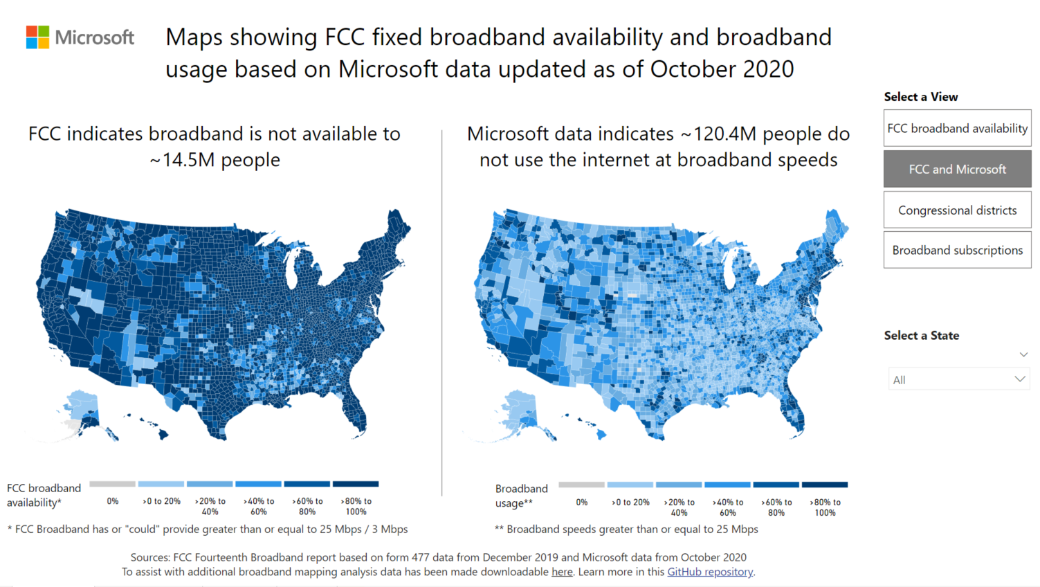
Microsoft released a new interactive Power BI report to show how differrent states and communities are affect by this digital divide. You can read more about it here.
ms_dashboard = 'https://app.powerbi.com/view?r=eyJrIjoiM2JmM2QxZjEtYWEzZi00MDI5LThlZDMtODMzMjhkZTY2Y2Q2IiwidCI6ImMxMzZlZWMwLWZlOTItNDVlMC1iZWFlLTQ2OTg0OTczZTIzMiIsImMiOjF9'
IFrame(ms_dashboard, width=800, height=600)
Wall Street Journal very recently pubslihed a series of articles on this topic to show rural areas in the US have lack of access to boradband internet. Watch the video below to learn more. This is consistent with my observations from the baove data.